Daily designer news |
| South Korean road signs by Studio Dumbar Posted: 23 Nov 2011 07:49 PM PST
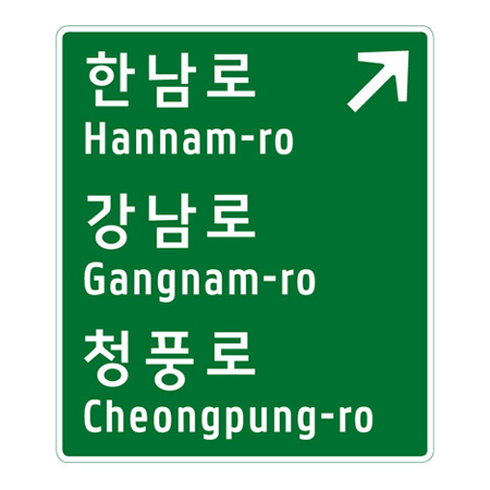
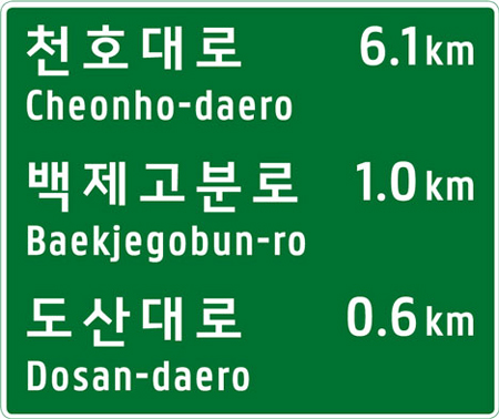
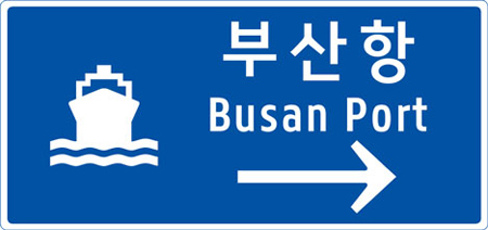
The national road sign system of Korea was redesigned by Dumbar, a Dutch studio with an office in Seoul. For that project, the typographer Pieter van Rosmalen created a typeface for the English translations. The font needed to be narrow to accomodate the long text, wide spacing was used to increase the readability. I personnaly love the font, but I’m not so sure about the pictograms, and really don’t like the arrows. I don’t get some of the color conventions as well, why is the ski pictogram in a black box suddenly? Via Dezeen.
|
| You are subscribed to email updates from Design daily news To stop receiving these emails, you may unsubscribe now. | Email delivery powered by Google |
| Google Inc., 20 West Kinzie, Chicago IL USA 60610 | |


No comments:
Post a Comment