Daily designer news |
- 12 cool architectural birdhouses
- Architecture below the surface
- 10 smashing web design freebies
- These simple tweaks will make your blog content instantly more readable
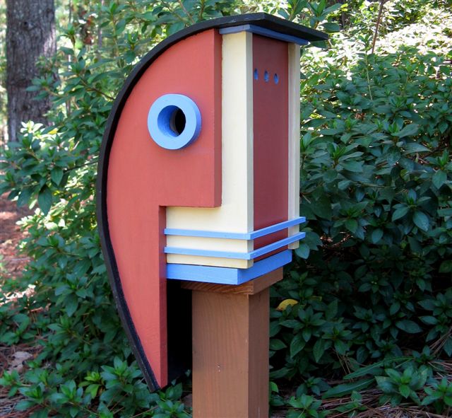
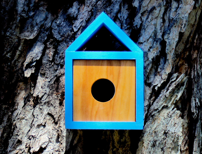
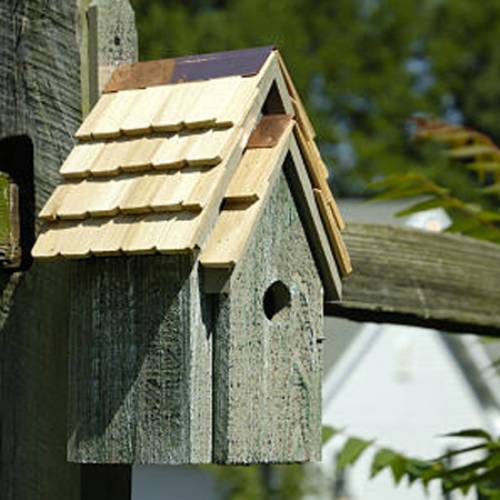
| 12 cool architectural birdhouses Posted: 15 Aug 2014 09:42 PM PDT Many people who have fond of growing birds in their own home or little garden, think of the cool houses for them. Here in this blog, I have collected 12 such cool architectural birdhouses that not only comfort your birds but also add extra beauty and fashion. 1. Architecturaleditions.comArchitecturaleditions.com is an online family business located in Pinehurst, NC which strives for uniqueness in design, excellence in workmanship with quality construction.
2. Birdhouse with a soulBirdhouse with a soul is not just a birdhouse that is contemporary, modern, different, and interesting, but it is the ideas behind the design – the idea that something as simple as a modernist birdhouse can change a perception.
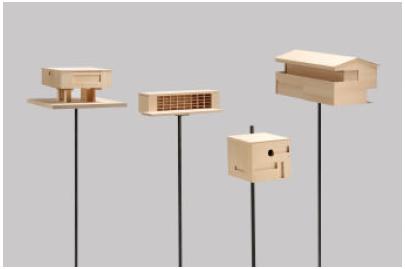
3. Modern BirdhousesModern birdhouses is named after Case Study participants J.R. Davidson, Richard Neutra, and Ralph Rapson that feature simple lines, modern detailing, and durable materials.
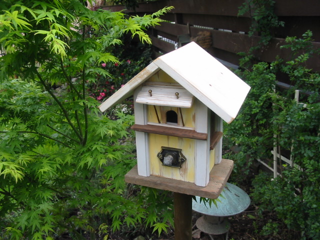
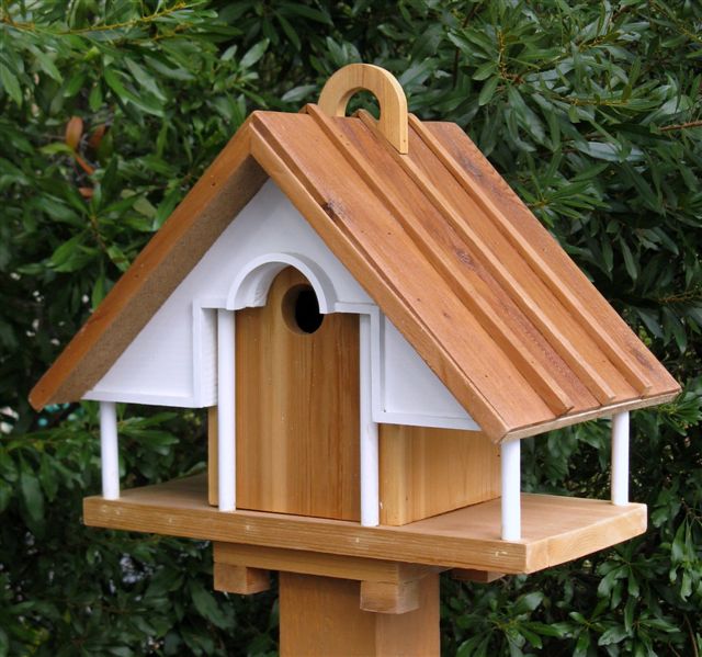
4. Pennsylvania Church Replica BirdhousePennsylvania Church Replica Birdhouse replica was constructed from solid pine to be a functional birdhouse.
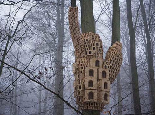
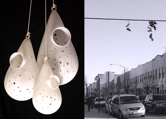
5. Enormous Bird houses Concept on City Trees in LondonThe "Spontaneous City in the Tree of Heaven" opened recently as part of the Secret Garden Project by UP Projects and hopes to develop into a haven of biodiversity and create a new public awareness of the ecological and cultural value of urban green spaces.
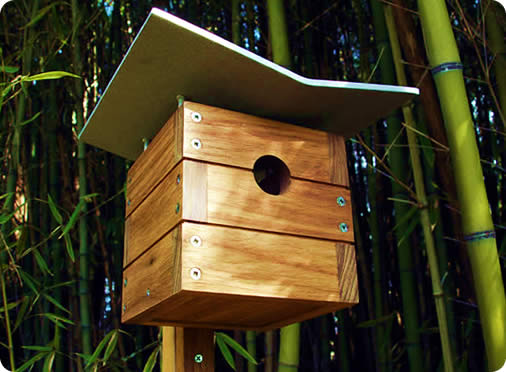
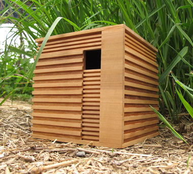
6. Eco-friendly designer birdhouses for modern birdsThis handsome, finely crafted, architectural birdhouse are handmade by Nathan Danials for his one-man company, Modern Birdhouse Design. The craftsmanship and style of these birdhouses is undeniable.
7. Nandinee Phookan ArchitectsThe minimalist, modern birdhouses by IMAKE STUDIO were developed specifically for small birds like wrens, finches, chickadees, nuthatches, and titmice.
8. Index reuse artThese rustic handcrafted birdhouses, feeders, and landscape art are from architectural salvage by Sonoma county reuse artist Ken Rhoads.
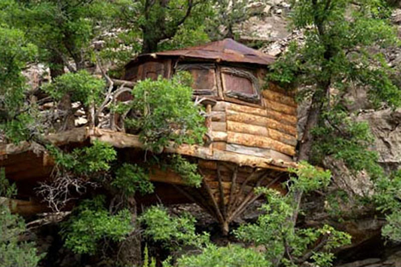
9. An Exotic Tree House shaped BirdcageThis is a unique architectural of an exotic tree house shaped birdcage which is a naturally creative architecture that emphasizes the art and beauty.
10. Heartwood 006 Bluebird Manor Bird Houses.In this beautiful birdhouse, Bluebirds were there to welcome the first settlers of Plymouth Colony, who called them blue robins.
11. Architectural sophisticated birdhousesArchitectural sophisticated birdhouses was designed by award-winning architect Richard T. Banks.
12. RESOLUTION: 4 BIRDHOUSESMost people associate Resolution: 4 Architecture with prefab — especially their work for Dwell's custom prefab collection.
The post 12 cool architectural birdhouses appeared first on Design daily news. Download the free transport icons package now! |
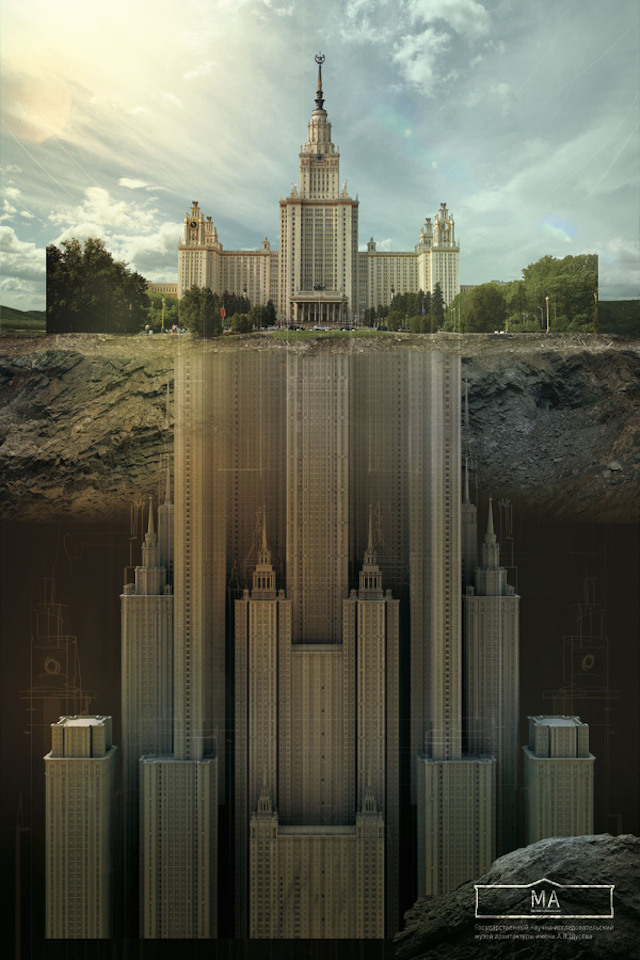
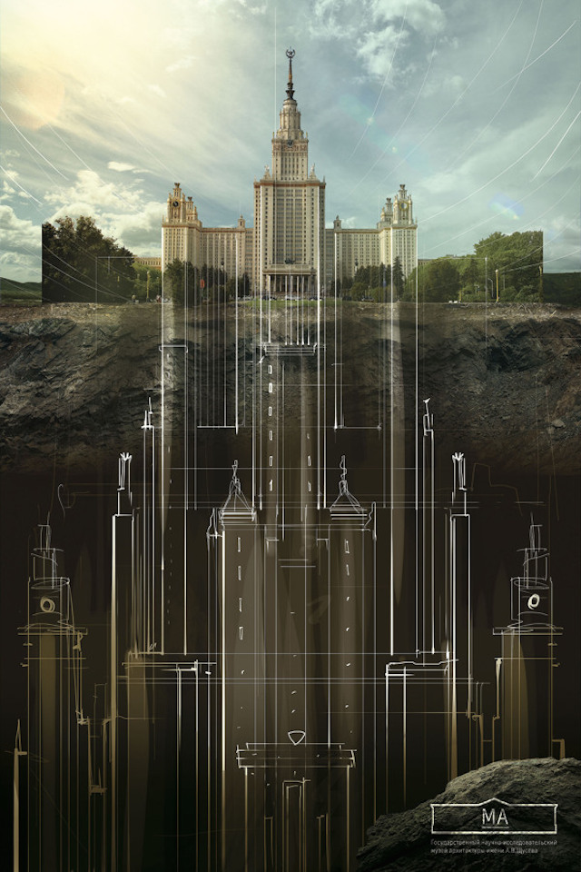
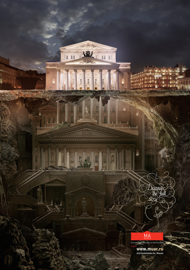
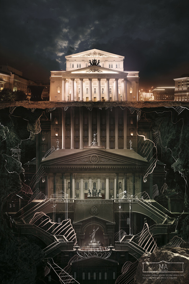
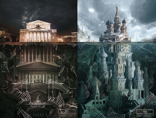
| Architecture below the surface Posted: 15 Aug 2014 08:34 PM PDT
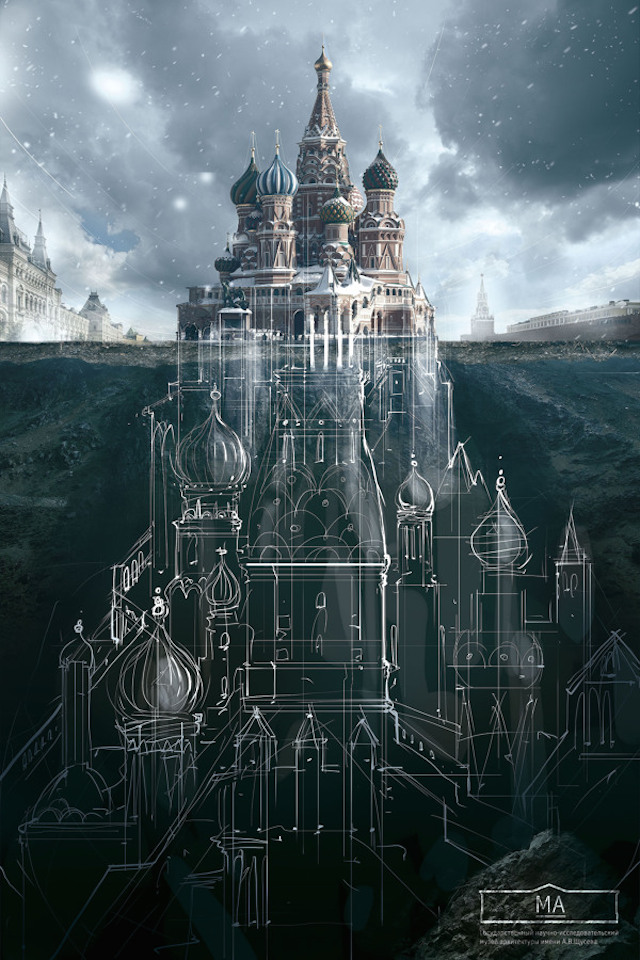
With the aim of changing creative ideas that transform client's businesses, brands and reputations, agency Saatchi&Saatchi Russia has revered as the hothouse of the world. They believe that with one team and one dream, nothing is impossible. They are absolutely transformational, accountable, ambitious, courageous, and passionate at their work. They have made illustrations campaign for the Schusev State Museum of Architecture in Moscow, entitled as "Below The Surface". The below given images are the perfect visuals to discover fictional undersides of different famous buildings. This is really a very creative and innovative production by Carioca Studio, to discover. Have a look at the below given images.
The post Architecture below the surface appeared first on Design daily news. Download the free transport icons package now! |
| 10 smashing web design freebies Posted: 15 Aug 2014 07:42 AM PDT DealFuel brings to you just the deals you need. Whether it is a new widget or plugin you need to give your blog that extra spark or it is your eBook you want to sell or an eCourse you want to take to master your web-designing or web-management skills. Dealfuel has all of it and more. What’s more? Right now we have 10 of its Freebies. Take your grab! 1. Stack Banner Rotation WidgetRotating banners are not just cool to look at, they also expose more of your content, above the fold. So, your readers will have access to more of your content as soon as they land on your home page. They are slick and give your site a contemporary look. You can add images, text content highlighting your product USP and videos too in the banners. Try out this free Stack Banner Rotation Widget to add this smart-looking yet functional feature to your site.
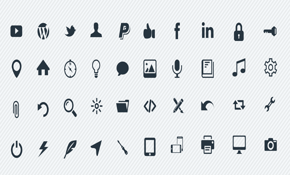
2. 100 Vector IconsA picture is worth a 1000 words, and a perfect icon is much more valuable on your limited site estate. If only finding the perfect icons was as easy as it is to be convinced about their importance. Not to mention, it’s not just enough for the icons to perfectly communicate your intention, but they have to all perfectly match each other – both in terms of size and style. The larger the icon pack, the better your purpose is served. Try out this free 100 Vector Icon pack.
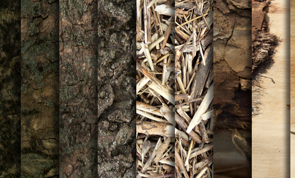
3. 26 High Resolution Wood TexturesJust like the way your home is decorated is a reflection of your personality, the design elements used on your site is a reflection of its content. Background images of wood or leafy separators for your content breathe life into your content. Especially, if your site caters to the “green” niche – be it an adventure sport like trekking, or an agricultural product or something more specific like a greenhouse or land-scaping. Here’s a bundle of 26 free, high resolution wood and tree textures to get you going.
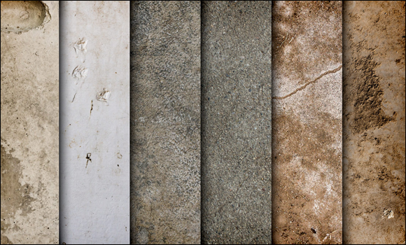
4. Concrete Texture PackIf wooden textures don’t fit your bill, maybe you want something more concrete? A cemented, stony or beaten look gives an edge to your site. Depending on the niche that your site falls in such textures can give a serious or a scruffy tone to your content. Such textures are perfect for a wide range of niches – from an archaeological site to one of a rock band – stony, or even granite textures create an ambience, just right. If that’s what you are looking for, give these free concrete textures a shot.
5. Vector Stars PackRemember that hidden joy of receiving a “star” as a token of appreciation? Why restrict joy by age? It’s so easy to spread that love on your own website. If you have a review site, or need feedback on anything, that sparkle in your stars is invaluable. Or of course, stars can be used instead of bullet points, to highlight content or to create an element of design too. Designing them though, is harder than one would think. Here’s a variety of vector star designs ready to be used as you need.
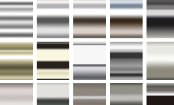
6. 15 Metallic Photoshop GradientsA steely metallic effect – whether used as a background or as a fill-in for text, gives a site a serious look. But, plain greys run the risk of being boring. Gradients are just the solution because they give the eye a variety and get rid of the monotony. At the same time, they don’t take away from the professional tone, by adding an element of unwarranted color. The site stays steely, slick and sophisticated. Here’s a ready pack of 15 free metallic gradients to pick from.
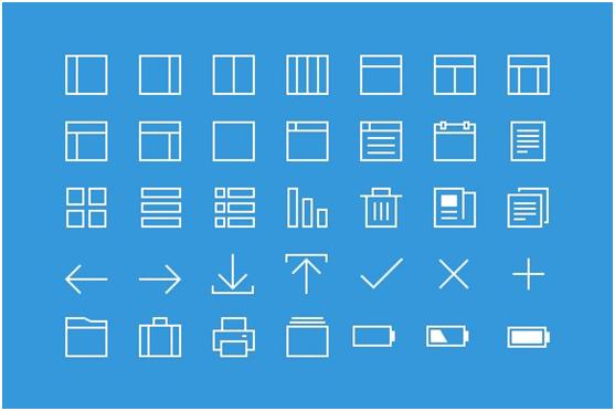
7. 35 Thin-Line IconsA professional website, needs non-intrusive and functional icons. To replace action words, minimalistic yet easily understandable icons keep the site clutter free. The reader stays engaged with what they’ve really come to your site for instead of being distracted by colorful, bulky icons. But, if we’ve designed or been part of designing anything, we know that simplicity doesn’t come easy. Here’s a pack of 35 free thin-line icons to make life a little simpler.
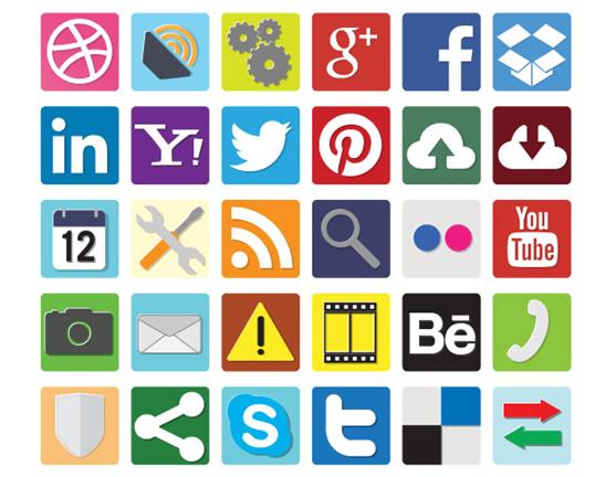
8. Flatteriffic Vector IconsBut, plain and simple isn’t necessarily what every site needs. Some sites need an extra spark, a dash of color to attract the reader’s attention and have them take an action by clicking on the said icons. Another concern is that a site needs a wide variety of icons from social media to interface and beyond. Adjusting one set of icons so that they match another set is an additional category of pain. So, what we need at times like these, is a ready mix of icons to pick and choose from. Check this set of free icons out to see if they fit your needs.
9. Smart Device IconsEvery once in a while, you need that perfect icon to convey what you have in mind. You are looking for that complete set of a niche icon pack but have to sift through hundreds of icons to find the one that is just right. Yet, you ultimately end up with an approximately close one. How you wish there were hundreds of variations available for that one icon that you want. Try this set of free smart device icons that covers this one niche thoroughly. Especially, handy for device comparison.
10. Cloud Stock ImagesCloud images must have been in use since color monitors for computers came into action. And yet, they are fresh. They still bring serenity. Also, images of clouds from different seasons and times of the day convey different moods to go with a site. They create a calming, soothing lull perfect for say a meditation website or for a site that talks about nature. The usage of cloud images is really limited by our imagination. Get your hands on these free stock images of clouds and bring bliss on your site.
The post 10 smashing web design freebies appeared first on Design daily news. Download the free transport icons package now! |
| These simple tweaks will make your blog content instantly more readable Posted: 15 Aug 2014 06:50 AM PDT
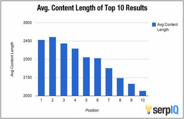
The majority of your website visitors don't read your blog posts from start to finish. That's a fact. It's nothing personal against your site or its content. It's just how people read on the web. In a research on how people read on the web, Nielsen Norman Group found that 79 percent of users scan new pages, while only 16 percent read word for word. That sounds troubling, but it doesn't have to. If you design your blog posts with the way Internet users consume content in mind, then they will be more inviting for people to read. For example, you would be better not publishing long walls of text knowing that most of your audience won't end up reading it word for word. What you need to do is make your content more "scannable" so readers can quickly pull out key bits of information while still absorbing your overall message. How do you do that? You have a few ways to do this. You can remove longform content from your site entirely, writing entirely in twitter-fashion and blaming yourself for the demise of critical thinking. You can go for a design that will do a great job highlighting the content you want people to see —some modern website layouts are built on that idea. Or you can go for more traditional, smaller techniques which would do wonders for you content. This article explains just that: a few ways to make your blog content so readable people won't have a chance to miss it. Break Down Your Content into Smaller PiecesBreak your long content down into shorter bits by making liberal use of various blog post styling options. Small paragraphs with headings, sub-headings, bulleted lists, quotes and so on work especially well. Give your most important points their own headings and paragraphs. When readers scan your content they will be able to grab the important pieces of information. If you have a series of important points to make, try using a bulleted list. Make your content easy for users to skim through. Publishing that content on a clean, modern theme wouldn't hurt either. Most come complete with a full selection of formatting options to ensure your content still looks pretty as you break it down into small pieces. Just be sure to avoid some popular mistakes. Go For Quality AND QuantityNeil Patel recently published a study on content length
It's curious that long content performs better, but do readers actually prefer it? When you understand that Google's goal is to deliver the very best search results for its users, it's also understandable that Google's tendency to deliver longer content is because that's what users prefer. For more evidence that users prefer longer content, look at social shares. Patel’s study shows that posts with 1,500 words receive 68% more tweets and 22% more Facebook likes than the articles with fewer than 1,500 words. Wrap Up Your Posts with A ConclusionI know that this sounds like basic blogging 101, but when you write a blog post make sure to tie everything together for the reader with a succinct conclusion. You'd be surprised how many blog posts are published each day without a proper conclusion, and this hurts because some readers actually go for the conclusion first. That's right, the first thing some readers do is scroll all the way to the bottom of the post to read the conclusion and see what the key takeaways are. Then, if they're intrigued by the conclusion, they'll go back and read the whole post. Adding a conclusion to your posts is a quick and easy way to make your content more reader friendly. Sweat the Small StuffIt's perfectly OK to become obsessed with minor details. Seemingly insignificant changes like a new font size or typeface can have a huge effect on the readability of your content. Keep tweaking and adjusting these small details until you find the combination that works best for you and your readers. Try running a new test each month, like changing body type from Helvetica to Arial, to see what kind of influence it has. When running these kinds of tests, measure the performance by comparing your 'time on site' metric in Google Analytics from month to month. Conclusion (See?)No matter how good your content is, it will just go to waste if it's not laid out for the web properly. You can instantly make your content more readable with simple tweaks like breaking it down into smaller pieces, going for longer word counts, adding a conclusion, and adjusting small things like font sizes. Don't hesitate to experiment, too — if anything, the Internet exists for you to share your ideas with other people. If you have any other suggestions for how to make content more readable, please add them to the comments section! About the author: Matt Southern is a writer who can't get away from the world of SEO and content marketing. He plays by the rules to avoid Google penalties, but really just wants a pat on the back from Matt Cutts. The post These simple tweaks will make your blog content instantly more readable appeared first on Design daily news. Download the free transport icons package now! |


| You are subscribed to email updates from Design daily news To stop receiving these emails, you may unsubscribe now. | Email delivery powered by Google |
| Google Inc., 20 West Kinzie, Chicago IL USA 60610 | |
No comments:
Post a Comment