Daily designer news |
| How to convince your clients of the importance of white space Posted: 06 Feb 2012 03:31 PM PST This is a recurring issue for designers around the globe. No matter if you are a graphic or web designer, you will sooner or later run into a client that finds the layout of your design too “empty”. This is a quite natural reaction for a non-designer. I remember in graphic design school, most students would add more elements in their layouts than needed, or they would make these elements bigger because they were afraid of too much white space. As a designer, you should probably already know that white space helps a lot to create more elegant designs, separate elements better from one another, and allow to focus and make things more readable. You client doesn’t know all that, so the best way to teach him is to explain him with examples that ring a bell for him. If you know your client well, you may find one of these examples fitting, who knows? FoodThis is the first example that I ever gave to one of my clients, maybe as an european I’m a bit too concerned with the presentation of food. Tell your client that he should remember the last time he went to a high-end restaurant. What did he see? A plate full of food like in a school cantine? Obviously not. What he saw was some food delicately dropped on the plate, with some color arrangements and… a lot of white space! The white space in that case, just like for graphic design, helps to create a layout with the food, putting a strong emphasis on the meal.
Use of white space? Check. Looking yummy? Double check. Image by William Schmitt on Flickr. GardeningGardening is a bit different, you cannot tell your client to just think about a garden, because many gardens are full of flowers and look beautiful that way. In that case, you will need to give him the japanese zen gardens as example. These gardens are very minimal, and the position of every rock or plant is studied to create a calm atmosphere.
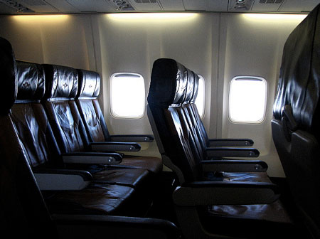
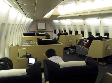
A zen garden. Notice the white space? Image by Tess on Flickr. First class vs second classTravelling in 1st class from time to time is a great way to understand the importance of white space, although in this specific example talking about empty space would be more appropriate. Nevertheless, travelling in 1st class is much more expensive mainly for one reason: you have more room for your legs or for reading your newspaper. That might ring a bell to your client and help him understand how a design can become more comfortable if you allow more white space to fit in.
Second class seats in an airplane. Image by Vik Cuban on Flickr.
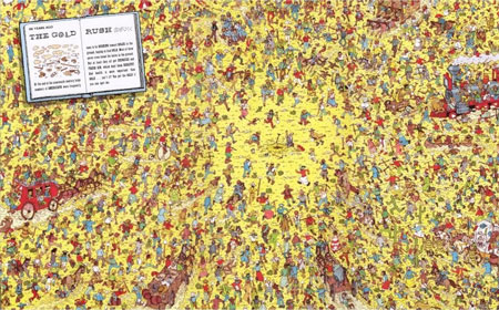
First class seats, notice a difference? Image by S. Yume on Flickr. Where is Charly?Remember that guy with the white and red stripes? Finding him in a double-page layout was often a pain in the ass because the illustrator drew tons of other little characters with features similar to Charly. Try to explain your client that his logo might become a bit like Charly if it is layed out in the middle of 50 other pictures and two tons of text. Trust me no client wants his logo to go unnoticed.
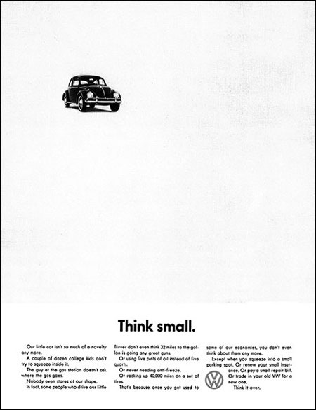
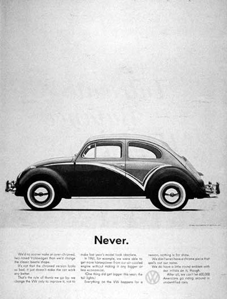
Where the hell is Charly? Not in the white space for sure. Famous adsLast but not least, you can use some famous ads to make your point. Try to find examples in your client’s industry. For example, if you work for a garage you can take some advertising made for Volkswagen, Mercedes or Mini Cooper. Seeing that succesful brands are not afraid of white space should assure your client that he can get away with it. Following are a few examples of car advertising making good use of white space.
|
| You are subscribed to email updates from Design daily news To stop receiving these emails, you may unsubscribe now. | Email delivery powered by Google |
| Google Inc., 20 West Kinzie, Chicago IL USA 60610 | |




No comments:
Post a Comment