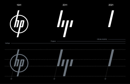
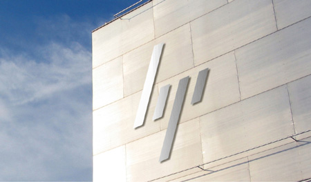
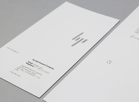
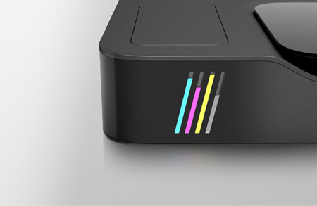
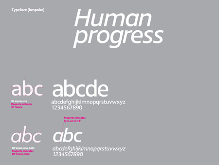
HP rebranding Posted: 15 Dec 2011 07:16 PM PST 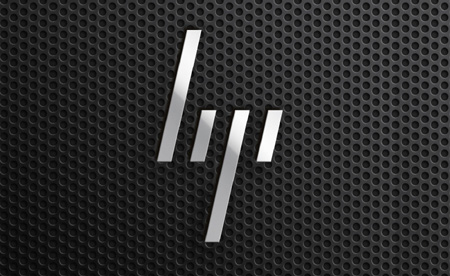 For its rebranding, HP chose the minimalist road. They kept the angle and vertical lines of the previous logo and removed pretty much everything else. Then the vertical bar is used everywhere in the branding applications. You can even see it on the printer’s side, so you’ll see the logo’s bar even when you can’t print in black and white because you have no more blue.

 
 |
No comments:
Post a Comment