Daily designer news |
| Posted: 12 Jul 2014 07:25 PM PDT
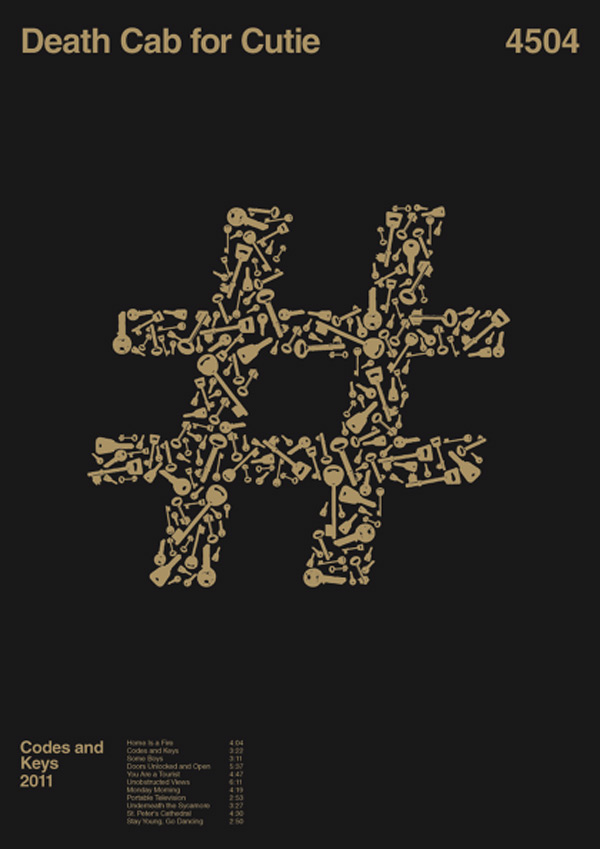
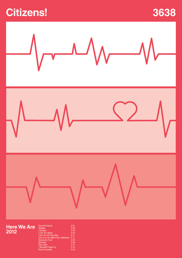
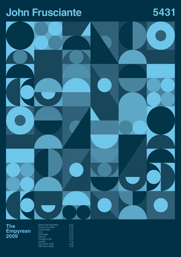
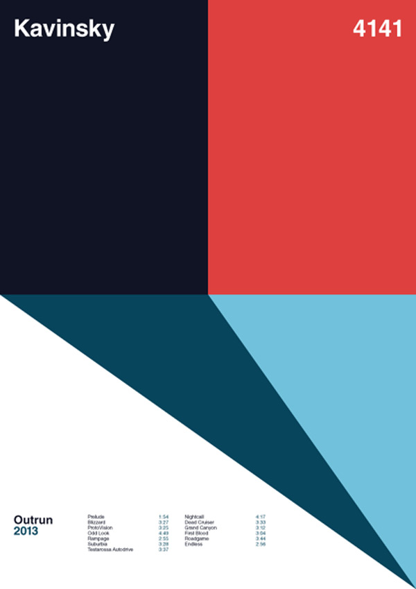
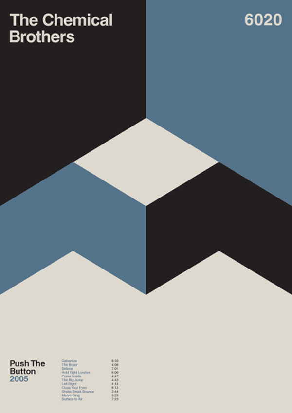
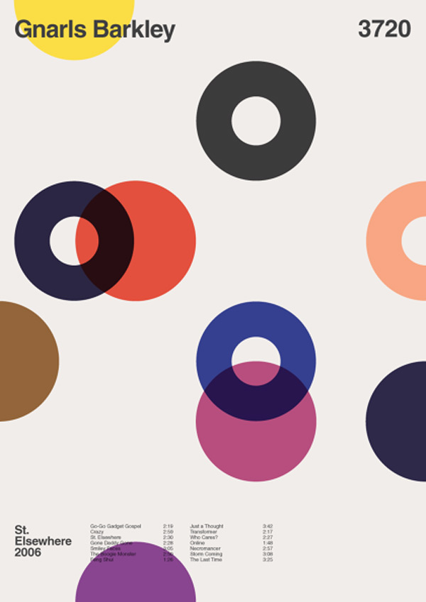
Album Anatomy is Duane Dalton’s side project, an exploration into minimalist graphic design. The designer did a great job of removing unnecessary information, he even went a bit too far on occasion. The idea of these posters was inspired by the great “Bridging the gap” poster series. A strict grid is used to create the posters, a constraint that probably helps a lot in keeping the whole series coherent. The font used in the visuals is Helvetica, an obvious choice for grid-based minimalist designs. Dalton alredy created over 70 designs. Unfortunately, the visuals cannot be acquired for copyright issues with the band names.
The post Album anatomy appeared first on Design daily news. Download the free transport icons package now! |
| Topographic Land Rover calendar Posted: 12 Jul 2014 05:52 PM PDT
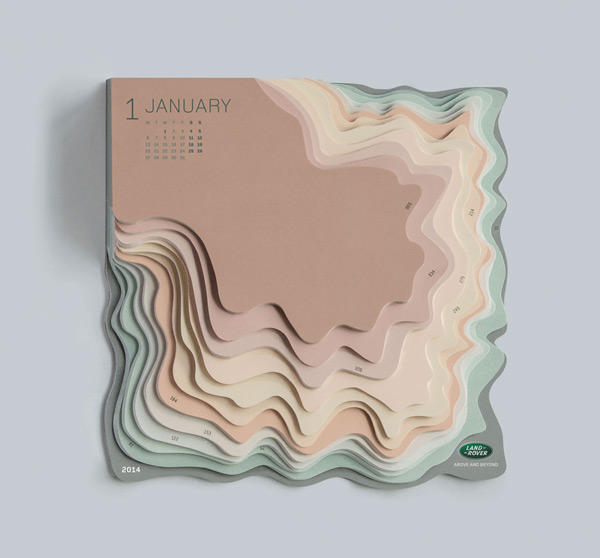
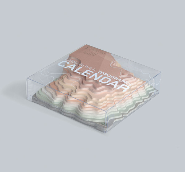
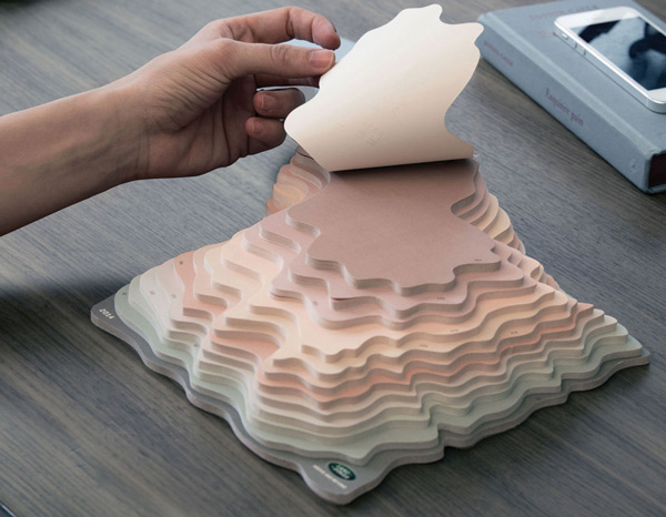
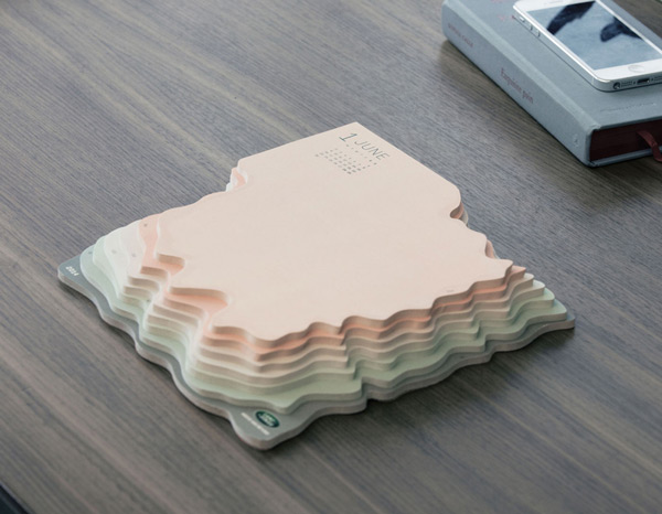
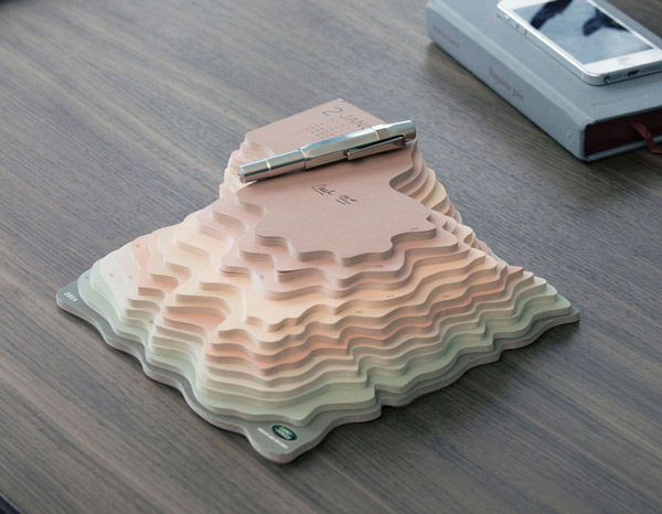
Do you think that paper calendars are boring? This calendar for Land Rover might make you think twice. This calendar designed by Zeynep Orbay reminds you of the car’s ability to conquer (almost) any landscape. Using topographic lines, it shows some depth that will be removed all year long. Every day gets a sheet, like in many calendar, and every month is separated visually by a specific shade of color and a shape that suggests it’s one layer on the map. The end result works very well, so you end up with a topographic looking map.
The post Topographic Land Rover calendar appeared first on Design daily news. Download the free transport icons package now! |
| You are subscribed to email updates from Design daily news To stop receiving these emails, you may unsubscribe now. | Email delivery powered by Google |
| Google Inc., 20 West Kinzie, Chicago IL USA 60610 | |


No comments:
Post a Comment