Daily designer news |
| 10 great examples of data visualization design Posted: 13 Aug 2013 06:29 PM PDT Looking for information on the internet has become second nature. New generations of people are growing up with no concept of researching and learning any other way. With instant access to knowledge comes the demand on companies to get the most information to their viewer as quickly and efficiently as possible. Data is everywhere now, from Google analytics, to Netflix recommendations, to… well virtually anything you want these days. Enter visualized data designs. Not only do these graphics breakdown large amounts of complex data into clear, digestible chunks for the viewer, they also leave a world of possibility when it comes to creating something the viewer will remember. Big data analytics can lead to a lot of insightful information, educating the viewer on an entire topic without boring them with excess information and unnecessary backstory. 10 impressive examples
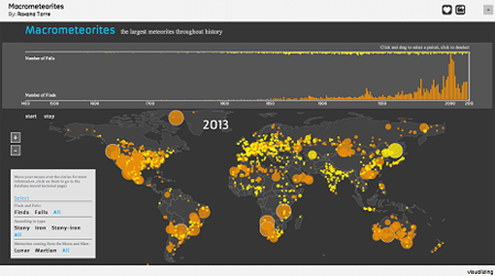
Macrometeorites teaches people about all the largest meteorites in history. Condensed onto one screen, the creator uses a grayscale map and contrasts meteorite hits with vibrant yellow and orange circles that gives the viewer more information as they navigate across the page.
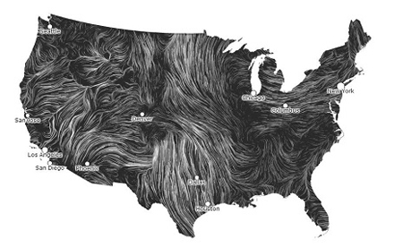
The Wind Map is an incredible, real-time visualization of wind speeds and patterns across the U.S. The map avoids the feeling of being overcrowded or visually unsettling by sticking to a monochromatic color scheme, which makes it much easier for the eye to understand.
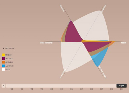
Worldshapin lets you compare health, carbon footprint, workplace equality, living standards, population, and education in various countries. The visual display is unusual, but simple and effective. There is also an informational box on each country you choose, so you can see the actual numbers.
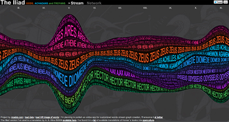
Any high school freshman has felt the pain of trying to decipher The Iliad. This graphic helps people figure out exactly whom Homer is talking about in each chapter of this epic tale. Using bright neons to classify each character’s rank, the designer emphasizes the prevalence of their role by changing the size of their name, making it easy to find exactly what you need.
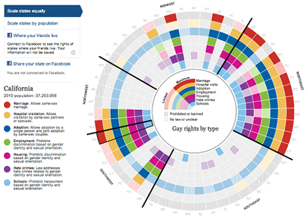
Talking about gay rights in America can be tricky. It’s a very complicated and sensitive subject, but this visualization manages to break down all the various laws by state and region. Color coated blocks line up to educate the viewer on what states do and don’t allow legally.
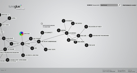
Audiomap is a great site to discover new music by letting you choose the direction you want to take relating artists to one another. Select an artist and hit expand to see similar choices. Follow the chain as far as you want. Your favorite artist could lead you to a forgotten band or a classic you’ve never heard of before.
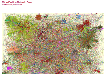
Gathering data on the most popular colors worn in Cambridge has led to the creation of a piece of artwork with this visualization. By setting up a fixed camera and taking hundreds of shots over time, this designer created a complex network of connected colors seen on the street that doubles as abstract art.
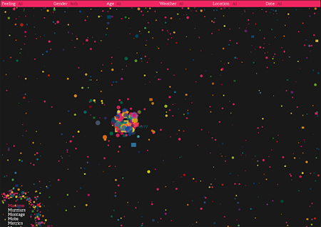
By harvesting statements of emotion from all over the internet, We Feel Fine has created a web of over 15,000 feelings that can be searched by different demographics. With brightly colored “particles” floating around on a dark background, users can pick any one out and read what the person has said in regard to that emotion.
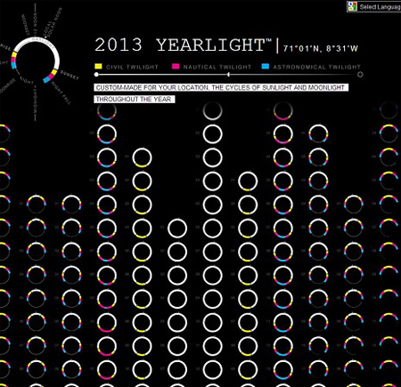
The Yearlight Calendar displays various types of light in your area (twilight, darkness, daylight, and moonlight) for each day of the year. The data is clearly displayed, but still easy to dissect and look at.
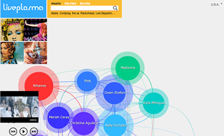
Liveplasma has created a very fun and interactive site to help people discover artists, movies and books. Not only can you sample some of the works you search for, but it also displays popular pieces by the same person and links it with other similar works that you might like with brightly colored threads on a white background. The post 10 great examples of data visualization design appeared first on Design daily news. Are you a blogger? Turn your posts into eBooks very quickly using MagPress, our Premium WordPress plugin. |
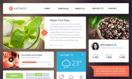
| Posted: 13 Aug 2013 06:01 PM PDT Every wednesday, we share a few freebies that'll make your designer toolbox a bit more useful. Flattastic UI kitA gorgeous flat design UI kit designed by Vlade Dimovski for Webdesigner Depot.
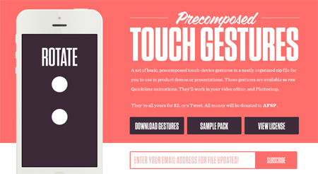
Precomposed touch gesturesA set of basic, precomposed touch-device gestures in a neatly organized zip file for you to use in product demos or presentations. These gestures are available as raw Quicktime animations. They’ll work in your video editor, and Photoshop.
PlatanA nice free font offered by Fontsta’.
StyliconsStylicons are made from vector shapes at 48x48px and comes as an organised PSD and AI master file, along with separate EPS, SVG, and PNG’s in three handy sizes.
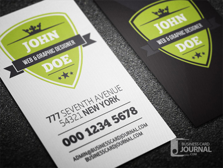
Retro Vertical Business Card TemplateA creative retro business card template with a modern touch. It looks really clean in a simple vertical layout with a retro shield badge.
The post Freebies wednesday appeared first on Design daily news. Are you a blogger? Turn your posts into eBooks very quickly using MagPress, our Premium WordPress plugin. |
| You are subscribed to email updates from Design daily news To stop receiving these emails, you may unsubscribe now. | Email delivery powered by Google |
| Google Inc., 20 West Kinzie, Chicago IL USA 60610 | |
No comments:
Post a Comment